Thursday, 25 April 2013

Final Animation

So after a week of hard work I've gotten to a decent finishing point in my animation, I think the colours work well, the animation itself flows along with the song, it's not what I originally intended (which was using 3d objects) but it's still a good attempt to follow the story board, some parts of my storyboard would have taken a long time to achieve so I've trimmed the original down. I also added a grain effect to the entire animation to give it an old tv like feel, but it doesn't show properly on the internet version (.mp4 compressed) but is definitely noticeable on the quicktime lossless version (.mov).


Here are some screenshots of my After Effects project showing the timeline (containing the elements of my animation) and my project bin showing files I imported in as part of the animation.


Overall the animation consists of a few shapes made in illustrator (coin and spiral) and then the rest is edited in After Effects, I created the clouds at the beginning of the animation using trapcode particular which is a beefed up version of After Effects' built in partical generator.

Thursday, 18 April 2013

Animation so far...

So after finding out I couldn't import 3d objects from Photoshop to After Effects I went to plan b which was to use 2d vector images made in Illustrator and manipulate them in 3d space. I could use the new ray trace 3d option in CS6, but you need a super powerful machine to use it properly.

To achieve the first 2 keyframes of my storyboard I knew I wanted an atmosphere to link with the title of the song, so using a plugin from Trapcode called Particular (a partical generator for After Effects) I looked up how to make some clouds and adjusted them to my liking, I also used CC Particles System II to create a starry sky in the background, this may be too literal of an interpretation but it looks cool so there.

The next stage involved multiple copies of a few coin shapes I made in Illustrator, lining them up and animating a camera (using a Null Object) to follow these coins, I animated them to the song and here's what I have so far:

A useful resource I found for learning After Effects was Andrew Kramer's Video Copilot which has a bunch of tutorials about everything, including camera animation.

I feel the colours are working great so far too.


Here is a screen shot to show how many layers I have so far and my workspace in general, I use the 'shy layers' option for all the coins, as they are only on screen for a short time.

Note to self: Need to add type at the beginning delay.

As my original story board was based on 3d hope, I'm going to need to adjust it to suit my current animating style.


Wednesday, 17 April 2013

Damn you Adobe.

So my original intention to create my animation was to create 3d object files using Maya and import them into After Effects and animate them.

I got as far as creating a coin and exporting it using Photoshop as a .psd only to find out that you are no longer able to import 3d psd files into After Effects as of CS6. So 3D is a no go.

I'll probably end up using Illustrator to create the elements of my animation and importing them to After Effects and use the camera depth of field to give my animation a 3d space.

I don't think the aesthetics would have been very nice in 3d anyway and it would probably take a long time to get the animation done, using 2d elements from Illustrator will be a faster more convenient way of animating.


Thursday, 11 April 2013

Storyboard

I decided to use the colours from the album cover and I think they go together really well, my animation will be digital using vector imagery and after effects mainly.

As for the song I didn't want to fade it out at the end but it's difficult to end it halfway anywhere, I will be doing the first 26 seconds of the Stratosphere Boogie, the first 7 seconds have a lot of cool rhythm that will fit well with my animation.


Colours


Above are some colour ways I grabbed from my research images below, the first is from the album cover for the song and think it may work really well in the animation, high contrast and futuristic for the time the song was released.

Abstract Animations

Monday, 8 April 2013

Abstract Interprations

Below are some abstract line interpretations of my (bloody complicated) song, to get an idea of the tempo, motion and characteristics of my song, using line weight, length and texture to translate my song into lines.

This was mainly an exercise to just get the song clearly into my head and understand how motion could work for my animation to try and relate the moving picture to my song in a clearly understood manner.


More Animation Research

My song has a really fast tempo so I want to animate according to that, to make my animation harmonic throughout and not play like a bad record, below are some animations I found on the internet that I think are something to aim towards with pace and some qualities to match my song.

First is a gif animation, I was listening to the song at the same time as watching it and it made a really good connection, it's only around 8 seconds long but I don't believe the frame rate is too high so I believe I could produce a 20-30 second animation like this, an important thing to note from this is it's looping quality, I could watch it for minutes.


Below isn't a fast paced animation at all but I think it has some neat ideas about how to interpret musical elements into motion graphics, and it's Pokemon, I know.


Another animation I found below has a distorted sound track but incorporates this quality into the animation, flashing shapes and is really well executed, I like the digital vector art style it has too, using isometric grids to give a structural quality (and probably make it easier to animate).

Thursday, 14 March 2013

Ideas Sketches


Awesome Animations


I can't imagine how much effort was put into this but I think it's one of the best animations/videos I've ever seen, it's like everything is synced with some part of the music, really great stuff.


The above animation is like an interactive comic book, it has a really unique way of telling the narrative to the audience, it's very enticing and makes you want to watch the rest.


Here is a great example of something like a zoetrope, done using a camera attached to a bicycle wheel.

I almost forgot about Jamie Hewlett and the Gorillaz, a fictitious band who have animations running throughout their music videos, recently these have become 3d model animations but here is a classic example of their 2d animation/illustrations.


Animation Causes Stress

So here are some pictures from the cell animation workshop, sketches of the logo we chose in different situations and forms and then the post it notes we decided on, it was a good but very stressful experience, everyone is going to finish their 24 frames and then we will put them into Photoshop or another program and make it into an animation that will be uploaded to YouTube/Vimeo.


Tuesday, 12 March 2013

Test Animation

I wanted to see what the forms of animation I might want to use had to offer, so I did some test animations just for fun, the first animation is a digital cell animation done in Photoshop using the animation tools it had to offer (converting layers into frames onto the timeline), It's definitely easier than drawing the frames on paper as layers can be fully transparent.

It has a nice quirky quality to it and doesn't take relatively long, especially with digital shortcuts you can utilize.

There is a part where some of the lines don't move and it's pretty noticeable, I'll have to thoroughly check my final animation for things that I may have missed.

Lastly I've looked into stop motion animation using iMotion HD on my iPad, it's very tedious and even with onion skinning enabled it can take a long time for a certain shot although I can see why people enjoy making and viewing them.


I'm definitely opting for digital animation, it might not have any traditional qualities but I think it's way more flexible (less limitations) and I will be able to use it to it's full potential on my final animation.

Design of the 50s and 60s.

World War 2 ended in 1945, it changed the world and design was allowed to bloom once more, here are some examples of the 50s and 60s I hope will inspire my animation, be it for a colour palette or design style.


These images scream retro, bright colours and bold shapes, happiness and full of life, these images will definitely inform my design choices during the storyboarding and animation process.

Monday, 11 March 2013

Print to Pixel


I have been given the Stratosphere Boogie by Speedy West & Jimmy Bryant for my animation piece, it has a very fast tempo, it's supposedly of the country genre, but I think it strays from that quite a bit, I believe it was around the 50s and 60s when this came out so I will look into the design themes that were around at that time and also relates to this genre of music.

Wednesday, 20 February 2013

Zine Research

I needed some major inspiration for my zine, to get my idea in order and help me think about the best way to achieve it, seen as I forgot to take photos of the zines we saw in the workshop.


Thursday, 7 February 2013

Final Packaging

So today I got my 1:1 scale net printed twice (accidentally) so I used one to practice for making the final, this turned out like a very good idea as I got used to the thick material and where to cut to/ score the paper. Here are some pictures of the first one:


 As you can tell it doesn't look very good especially when you can blatantly see my net lines so clearly, it all fit together just how I wanted it to though which was a relief.

Then my second attempt (with net lines set to around 20% opacity) which turned out way better, with more precise cutting and using super glue instead of normal pritt stick.


 The only problem I have with the final version is my net lines, I could have totally removed them but it would have taken all day to get the cuts all right and score the proper lines so I had to compromise. 

Another issue was the prints came out slightly darker than intended, I'd get them printed again but it's expensive and these show what I was aiming for fine.

Tuesday, 5 February 2013

Colour Choices

There is a lot of thought that gets put into the colour schemes we see in every day life, as there is a lot of underlying psychology and messages that get sent with certain colours, for instance red could be hot, love or blood, all different messages that are sent by one colour, a quick google search lead me to this site:

http://www.colormatters.com/

Which states the most common properties of colours we see, combining this with colour theory we can make attractive colour ways to use in design, below I have looked at a few possible options for the outer design for my packaging, as this is the first thing my audience will see I want to set a good first impression, by not using garish colours that aren't nice to look at.


Overall I think i've done a pretty good job, I did 4 individual colour ways and then experimented by swapping them around with each other, the one's I like most are number 1 and 2 even though orange could be a risky colour choice as it's a love or hate colour.

I want to send a message of reliability and warmth in my package, making it friendly to the audience.

After applying these colours to my packaging they didn't work too well, the difference in values is too much and make them look too bright, I came up with a totally different set of colours for the outside that link to the illustrations inside, a hazel colour for a wooden look and then black for the logo.

This is pretty simple but I think it works well overall.

A good site I came across that people submit colour palettes to is http://www.colourlovers.com/ could be good for future use :)

Saturday, 2 February 2013

Illustration Progress Shots

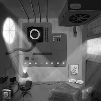
In this post I have added progress shots of my illustrations, this will shows the journey I take on doing my work, to start I use only black and white to get the base values down, I try to add details and some lighting but will later render these in a cleaner more attractive way after I have added colour to the piece.

A technique I use to aid me in doing better work is flipping the canvas (taking advantage of the digital medium) so I can see my drawing in a different light, it gives the same effect as walking away from your work for a while and coming back to it.


After a day of drawing this I feel i've reach a sort of finished stage, I will probably come back to it after i've got the other 2 to the same standard and add some more detail and enhance the colour, once I have the 3 illustrations finished i'll add them to my 3d render and see how they look in 3d space and then further edit them if I feel it is needed.

Here are the progress shots of the 2nd illustration, which is going to be a temple in a desert that is built of books in a desert sort of environment, I forgot to take earlier screenshots as I got carried away but so far I have gotten the basic values and lighting down and it just needs further refining of details, wanting to get some book titles on the spines and just add some basic realism, I will use another technique that is unique to digital painting that utilizes the colour dodge setting on the brush to 'pop' the highlights and make it appealing to the eye.


 After another day of drawing I've gotten the second illustration up to a point where i'm pretty happy with it, I think it's just a case of practice makes perfect, the perspective and depth is there, just something missing, I prefer my first illustration but I think that's just because it relates to me more, it's still decent and will work for my packaging. Tomorrow I will start on my final illustration and get that to the same stage as these, then I will spend a day refining them all and adding anything I may have missed in the moment.

Last but not least we have my 3rd illustration in progress, so far I've got interests in technology and reading, now to show my artistic side, here is the progress of my last piece.


And I'm done, I think for 3 days of work the 3 illustrations are up to a good standard, if I had more time I would work on them further but I need to finalize my design for the outside of my packaging, I believe they help explain my interests and who I am as a person.

Friday, 1 February 2013

This is my way of thinking.

So during this project I wanted to take advantage of past knowledge i've gained whilst looking into 3d modelling in my spare time, the main reason I wanted to do this is because I can almost guarantee my real paper model will not turn out too well, so I wanted to show my packaging in it's perfect form!

Below are some models i've made/textured using Photoshop and Blender (which is free software and very easy to learn), at the minute these are just some ideas I wanted to take forward from my sketchbook and I will develop one of these for the outside of my packaging, I took advantage of the 3 logos I made but I'm going to use the more artistic logo for my final.

I will do a final version of a 3d model when my 3 illustrations are finished for the inside and I have finalized everything, I think the images could do with an extra light source to make it brighter but it will be a nice presentational feature to add to my final hand in.